SMaRT Plan App
Overview:
╰┈➤ˎˊ˗ Project type: Web App Design
Client: St. Jude Children’s Research Hospital
Role: UI/UX Designer (user research, IA, wireframing, prototyping, usability testing)
Timeline: Mar. 2024 – Jun. 2024
Tools Used: Figma, FigJam
Audience: Postdoctoral Researchers, PI/Mentors, St. Jude Administrators
Objective: Design the SMaRT Plan web app so postdocs and mentors can easily set shared goals, define milestones, document progress together, and support long-term career development in a clear, structured workspace.
Outcome: Delivered an experience that made quarterly reviews smoother, reduced confusion around expectations, and helped postdocs feel more supported and confident in planning their research and career paths.
Background: The Blue Sky Initiative
This project was part of St. Jude’s Blue Sky Initiative, a program created to fund innovative ideas that improve the research and training environment for postdocs. The SMaRT Plan concept was selected for development and received funding to move forward as a real, usable tool for postdocs and mentors across the institution.

Problem:
Postdocs and mentors at St. Jude needed a structured way to define goals, track progress, and align expectations throughout the research training process. Existing planning methods were inconsistent, difficult to maintain, and often led to miscommunication during quarterly reviews. With this, postdocs lacked clarity on next steps, and mentors had no centralized place to monitor development or provide timely feedback.
Research:
User Groups:
→ Postdoctoral Researchers
・ Wanted a clearer way to track goals, milestones, and expectations
・ Desired a tool that supported both research progress and long-term career development
→ Principal Investigators (Mentors)
・ Valued an efficient system for reviewing progress and preparing for check-ins
・ Wanted shared visibility into goals without searching through scattered documents
→ Program Administrators
・ Needed consistent reporting and easier onboarding for new postdocs
・ Prioritized a system that supported compliance and documentation for training programs
Personas:
Experience Goals (from users):
Through interviews and early discovery sessions, postdocs and mentors consistently emphasized the importance of:
・ Effortless navigation & clear UI
・ High engagement through check-ins and progress visibility
・ Timely progress tracking
・ Adjustable timelines
・ Easy access to resources
・ Efficient communication with PIs
Outcome Goals
Users ultimately wanted a tool that:
・ Supports career readiness
・ Clarifies goal-setting
・ Structures postdoctoral training
・ Enables progress reviews
・ Facilitates regular PI feedback
・ Provides tailored postdoc resources

Persona created during early discovery using FigJam to synthesize user motivations, needs, and challenges.
Key Findings:
・ Users relied on multiple disconnected tools (Word docs, email threads, Excel sheets)
・ Quarterly reviews felt repetitive, confusing, or inconsistent between mentors
・ Postdocs wanted more ownership over their career development plans
・ Mentors wanted clearer guidance for structuring productive check-ins
・ Everyone needed a tool that was simple, structured, and quick to update
Comparative Research:
・ No direct competitors as most institutions use PDF templates or manually-built systems
・ Tools like Notion, Trello, and academic progress trackers inspired
・ clean layout
・ flexible structure
・ progress visibility
My Goals:
⤷ Reduce cognitive load
⤷ Support collaborative editing
⤷ Provide clear milestones + progress indicators
⤷ Make review cycles fast and trackable
˗ˏˋ Project Timeline ˎˊ˗
March
April
May
June
Discovery
Research
Information Architecture
Testing
・User Interviews
・Problem framing
・Personas
・Competitive view
・Sitemap
・User flows
・Feedback sessions
・Usability refinements
Design
Iteration
・Low-fidelity wireframes
・Mid-fidelity wireframes
・High-fidelity prototype
・Final UI updates
User Flows:
Focused on creating, reviewing, and updating plans. Users needed easy access to milestones and shared views.
⁀જ⁀➴
Information Architecture
→
.png)
Low-Fidelity Wireframes:
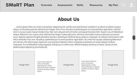
I started with low-fidelity wireframes to validate layout, hierarchy, and major interactions before moving into visual design.


Visual Exploration:
I created several visual styles so stakeholders could see different ways the interface could look and feel. This made it easier for the team to choose the direction that best matched the project’s goals.
Illustrative
→


I explored a more illustrative direction to create warmth and reduce the heaviness of career planning.
Medical
→


This option mirrored the clean, clinical interfaces often used in hospital tools, prioritizing minimal distractions and clear linear workflows.
St. Jude Style
→


Here I aligned the interface to St. Jude’s visual system to strengthen trust, consistency, and familiarity for internal teams.
UX Decisions:
These decisions were guided by feedback from postdocs and mentors who needed clarity, structure, and fewer steps to complete key tasks. Each choice focused on reducing friction and making career development feel more organized and approachable.
1. Restructured Navigation:
I simplified the app into clearer sections (Dashboard, Plans, Milestones, Reviews) so postdocs and mentors could find what they needed without digging through menus.
2. Standardized Plan Workflow:
Created a consistent flow for building a plan - “Create → Add Goals → Set Milestones → Review.”
This reduced confusion and made expectations clearer for both sides.
3. Cleaner Milestone Tracking:
Introduced a more visual milestone list with clear statuses so users could quickly see progress at a glance.
4. Prioritized Career Resources:
Surfaced them on the dashboard and linked them directly to related milestones. This reduced time spent hunting for information.
Visual Design:
St. Jude provided a visual identity guide for colors, typography, and accessibility standards. These guidelines informed the final design system to ensure consistency with existing institutional branding.


High-Fidelity Design:
・ Translated low-fidelity wireframes into polished, branded interfaces aligned with St. Jude’s visual guidelines
・ Applied system-level consistency: spacing, components, grid, typography
・ Refined content hierarchy to help postdocs understand what to do at each step
・ Introduced visual indicators for progress, milestones, and shared mentor/postdoc responsibilities.
・ Created multiple design variations and iterated based on stakeholder feedback.
Due to confidentiality and the app being in a protected beta phase, final high-fidelity screens cannot be shared.
Outcomes:
・ Provided a clearer structure for postdoc–mentor collaboration
・ Reduced confusion around expectations and review requirements
・ Improved visibility of goals, milestones, and progress over time
・ Early feedback showed postdocs felt more confident preparing for quarterly reviews
Reflection:
